Accessibility

Introduction
The web is continuing to change. Voice assistants like Siri, Alexa, and Cortana often provide responses by reading from web pages using screen reader technology. Similar methods have been around since the early days of personal computing. Captions (sometimes referred to as subtitles) were created for people who are hard of hearing, but are increasingly used for convenience by everyone, and the vibration mode of the smartphone is now a standard feature. Other groups that enjoy using captions include individuals with ADHD, who use them to maintain focus, non-native speakers, who rely on them to enhance language comprehension, and people in noisy environments, where spoken content might be easily missed.
Modern devices and platforms offer many options for accessibility. These help to personalize the user experience for both people with disabilities as well as the general public. But not many people open the accessibility menu to try them out.
Good accessibility is beneficial to everyone, not just those with disabilities. This is a fundamental principle of Universal Design. As Tim Berners-Lee stated: “The power of the Web is in its universality. Access by everyone regardless of disability is an essential aspect.” The COVID-19 pandemic made it clear that improving accessibility for digital interfaces can no longer be perceived as optional. It is increasingly hard to navigate the real world without reliable access to the virtual world.
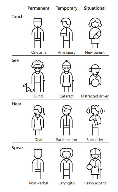
Microsoft’s Inclusive Design Guidelines go beyond permanent disability scenarios and extend them to temporary or situational limitations. Human abilities vary. No matter if a person has lost an arm (permanent), or is wearing a cast because of an accident (temporary) or holding a baby (situational limitation), being able to use the computer or phone with one hand or voice interaction benefits them.
This image and approach is courtesy of their Inclusive 101 Guidebook.
Governments worldwide recognize that digital accessibility is not only a moral obligation but also in many instances legally required. Accessibility is also great for commerce and democracy. For example, the European Union (EU) mandates that by June 2025, websites in a wide range of sectors must adhere to the Web Content Accessibility Guidelines (WCAG) principles (via the EN 301 549 standard). This will ultimately allow more people to buy and sell services in the EU. Other countries passed similar laws, which increase the pressure on organizations to make their virtual offerings more accessible.
Standards referenced in legislation like EN 301 549 and Section 508 are based on the Web Content Accessibility Guidelines, and the automated accessibility tests used in this report can only test against some parts of the guidelines. Our tests leverage the open source tool, Google Lighthouse, which in turn uses Deque’s open source axe-core.
There is a lot of updated information on our report from previous years. It is useful to track changes over time, and note where change occurs. We also wanted to introduce a new section about different sectors and web accessibility. Through our analysis we can track CMS’s, JavaScript frameworks, and evaluate the average accessibility of different technologies. We can also compare the accessibility of different countries and governments and track how it changes over time.
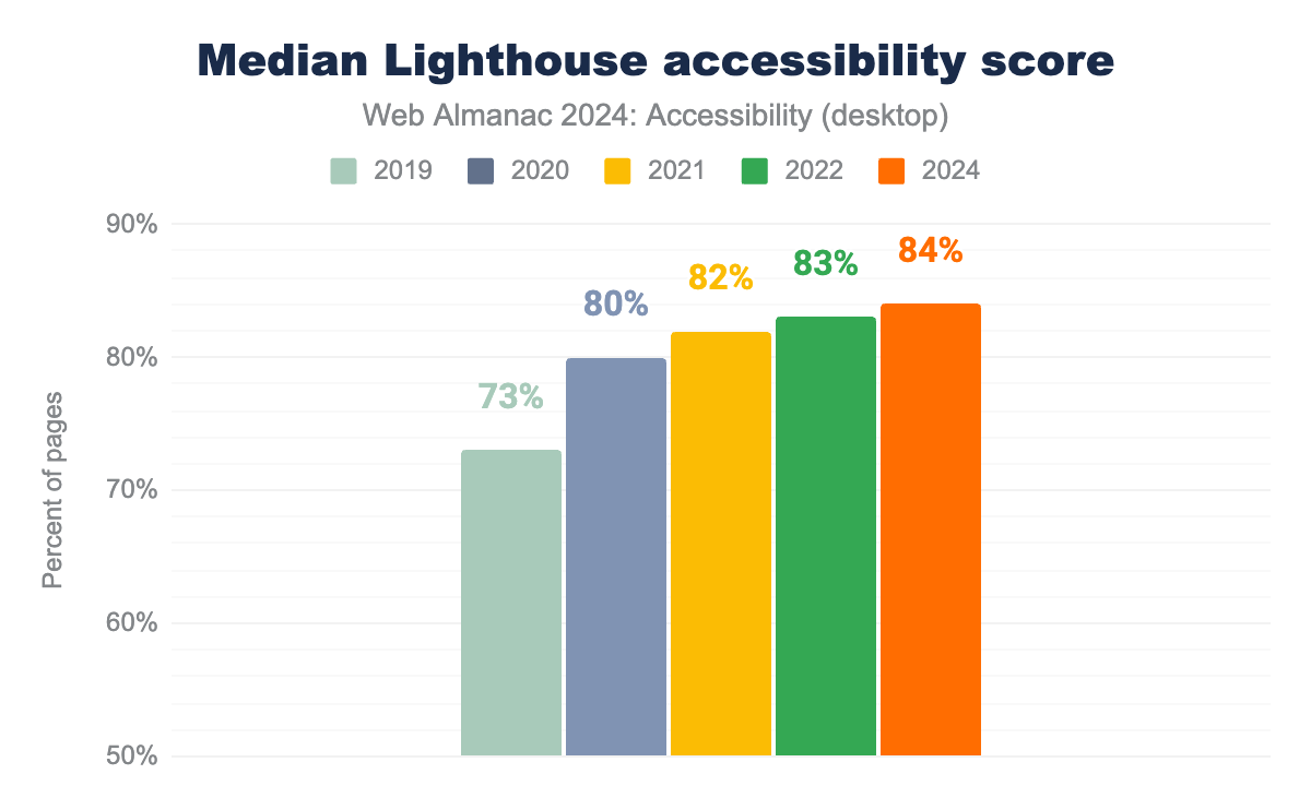
Despite ongoing challenges, there has been noticeable improvement in web accessibility. The median score for Lighthouse Accessibility audits rose to 84% over the past two years. In WCAG 2.2, the 4.1.1 Success criteria was removed. Deque therefore removed duplicate-id and duplicate-id-active audits from axe, and so this was no longer included in our scan. These depreciated axe rules impacted millions of sites surveyed in our 2022 report. There were also new Success Criteria added in 2.2 added with corresponding tests being added to axe-core.
Accessibility scores are an important tool, but people familiar with Goodhart’s Law will know the danger of a measure becoming a target. We must also acknowledge that automated tests can only address a portion of the WCAG Success Criteria, and that a perfect score does not guarantee an accessible site.
We can similarly see an increase in the median Lighthouse score by page rank with an increase in the percentage of pages evaluated. It is a smaller improvement than it was between 2020 and 2021 and the 2023 Web Almanac wasn’t produced, so there is a 1% increase for two years. However, it is also worth noting that the Lighthouse score is leveraging axe, which has increased its tests to align more with WCAG 2.2.
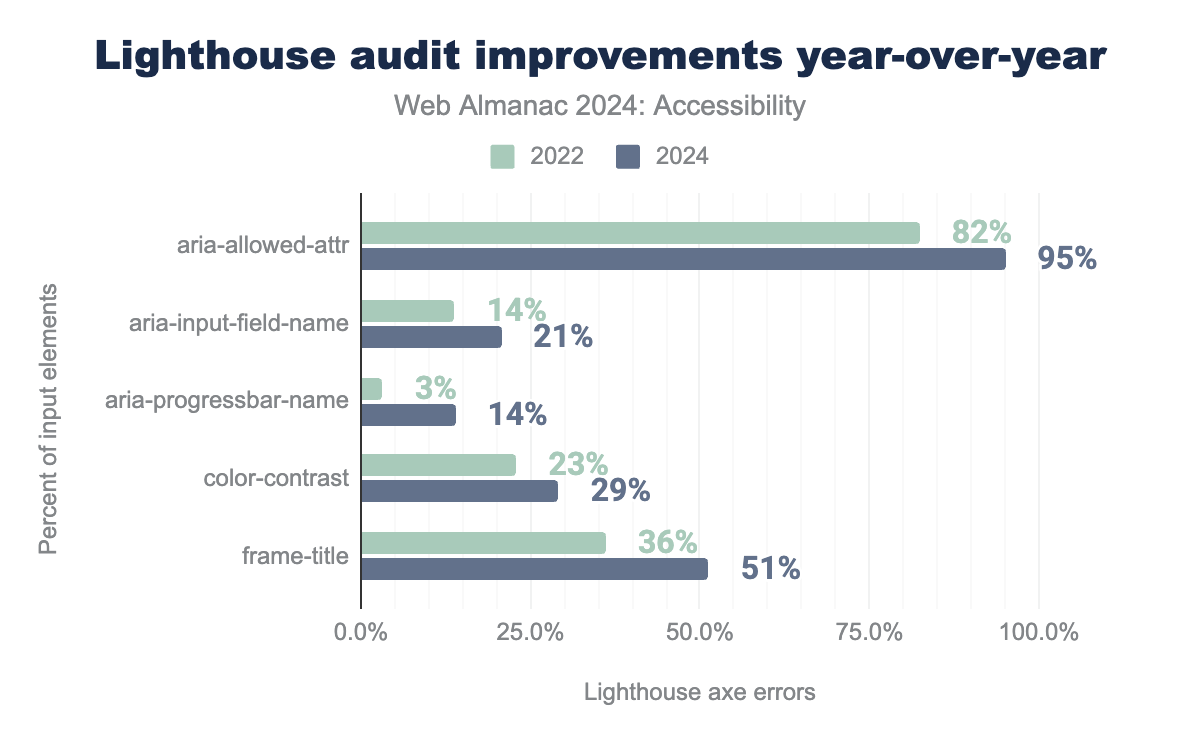
Looking at the most common errors with most improved Lighthouse tests, it is possible to see which parts of the Lighthouse audit improved the most. Although far from perfect, we are seeing advancements.
aria-allowed-attr passes on 82% of sites in 2022, and 95% in 2024. aria-input-field-name passes on 14% of sites in 2022, and 21% in 2024. aria-progressbar-name passes on 3% of sites in 2022, and 14% in 2024. color-contrast passes on 23% of sites in 2022, and 29% in 2024. frame-title passes on 36% of sites in 2022, and 51% in 2024.Google Lighthouse now contains 57 different audit tests which they use for their scoring. These are all based on Deque’s open source axe-core, which is widely adopted in a range of accessibility products and services. With the exception of 7 audits (aria-meter-name, aria-toggle-field-name, aria-tooltip-name, document-title, duplicate-id-active, html-lang-valid, and object-alt) there have been improvements across the board. Both object-alt and aria-tooltip-name were called out for their improvements in 2022, but sadly this improvement was not repeated in 2024.
Throughout this chapter, we have included actionable links and solutions that readers can apply and follow in their own accessibility initiatives. For the sake of consistency, we opted to use the person-first language “people with disabilities” throughout, though we recognize that the identity-first term “disabled people” is also widely used. Our terminology choice is not intended to suggest which term is more appropriate.
Ease of Reading
Readability of information and content on the web is crucial. There are different factors in a website that contribute to the content’s readability. Taking these aspects into account ensures that everyone on the internet can easily consume the content. This report covers those things which can be measured, and although plain language is critical to readability, it is not easy to measure. There are fairly straightforward mathematical readability scores, like Flesch–Kincaid. Some people use it to determine readability in English, but the web is global. Language is difficult, and there is no agreed-to standard for automated plain language testing that can be applied even across the most popular languages.
Color Contrast
Color contrast refers to the difference between the foreground and background colors of elements on a page that enables users to see the content. It is very common for websites to have insufficient contrast on key elements like text and icons, despite WCAG making it quite clear how to comply with contrast guidelines.
The minimum contrast requirement defined by the WCAG for normal sized text (up to 24px or if bolded 18px) is 4.5:1 for AA conformance and 7:1 for AAA conformance. However, for larger font sizes, the contrast requirement is only 3:1 as larger text has increased legibility even at a lower contrast.
Google Lighthouse can easily test for most but not all color contrast issues. There are a wide range of open source tools for checking color combinations which can be easily incorporated into anyone’s workflow. It is important to note that the use of these tools is necessary, as you can’t rely on your own perception of sufficient contrast when you have typical contrast sensitivity.
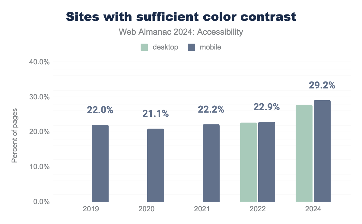
The Lighthouse test determined that 29% of mobile sites and 28% of desktop sites have sufficient text color contrast. This is a moderate improvement over previous years, but it is still far below what is required for basic readability.
Color contrast becomes more important as we age. It is also something which regularly is an issue for temporary disabilities and situational limitations, such as when people don’t have their reading glasses or need to read content outside. Achieving appropriate contrast is becoming more challenging as browsers and operating systems have implemented support for light, dark, and high-contrast modes. These are well supported by browsers and operating systems, but not yet well supported by most websites. There is a growing demand for sites to follow a user’s set preference, and multiple types of disabilities can benefit from giving users this control. See the User preferences section below for more information.
Zooming and scaling
More than ever, users are engaging with websites with a variety of technologies from super-wide curved screens to mobile phones and even watches. Disabling scaling takes away user agency to define what works best for them. WCAG requires that text in a website must be resizable up to at least 200% without any loss in content or functionality.
We’re revisiting Adrian Roselli’s post, which we previously highlighted in 2022, to emphasize the importance of not disabling zoom functionality, as many still don’t fully understand the reasons behind it.
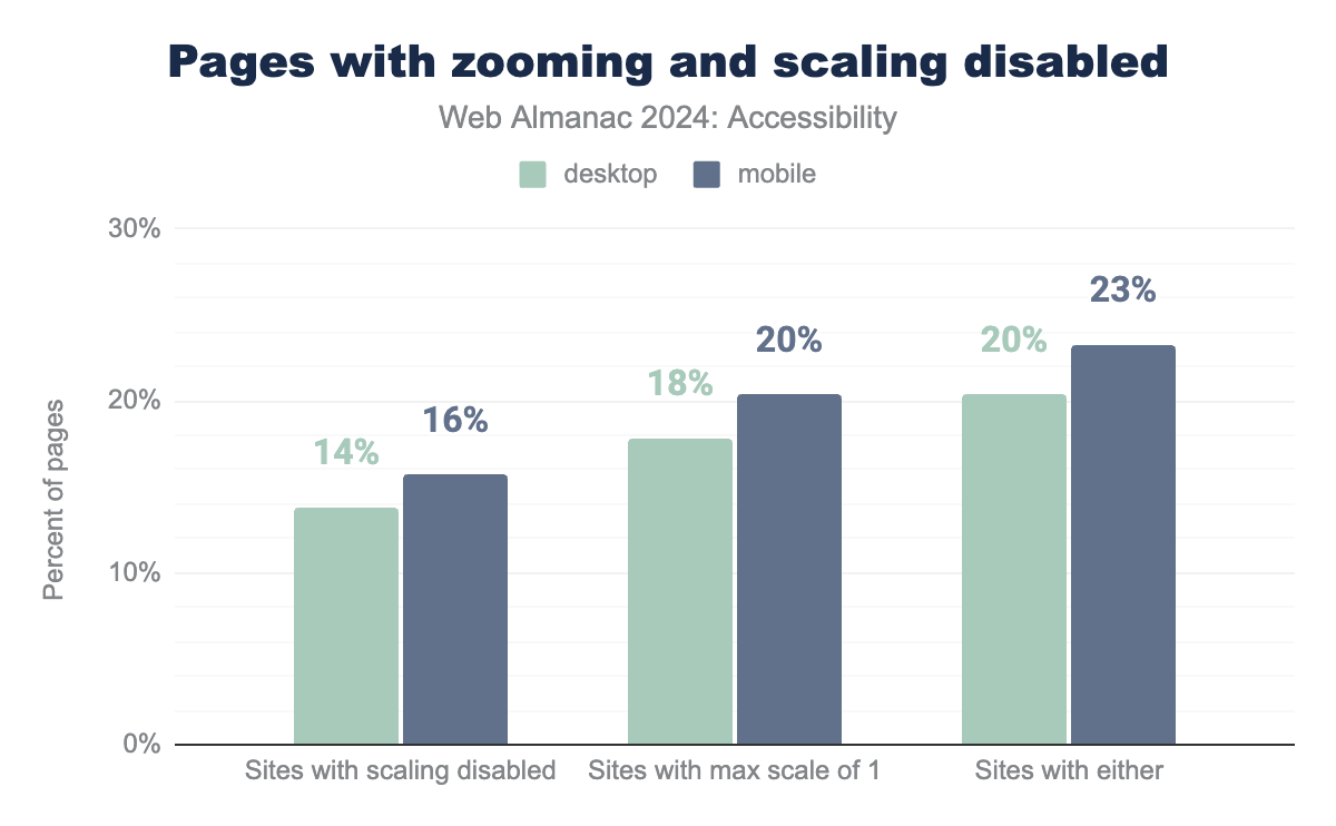
We are happy to say that we are seeing a reduction in sites which are disabling zooming and scaling. Compared with 2022’s data for mobile users there are 2% less sites who have disabled scaling and 4% that have disabled a max scale of 1. The desktop average both went down by 2% compared to the last report. Users can configure their browsers to override this setting, but some defaults still respect the author’s preferences.
To check if your site has disabled or limited zoom look at the source of the page and search for <meta name="viewport"> if it is tagged with a maximum-scale, minimum-scale, user-scalable=no, or user-scalable=0. Ideally, there wouldn’t be any restrictions for content resizing, but WCAG only specifies the need for 200% magnification.
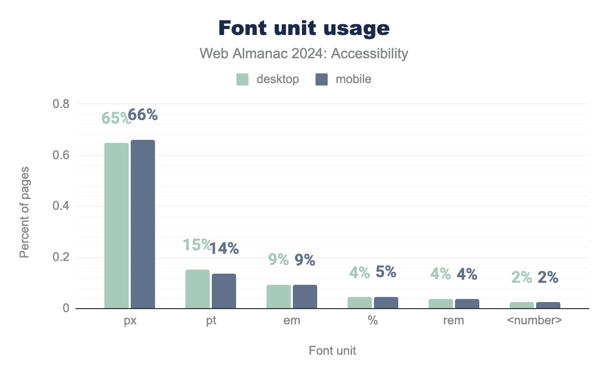
<number> on 2% of both, and finally pt on 15% on desktop and 14% on mobile.How font sizes are defined also affects the readability, as pixels are not as flexible as other units. Pixel (px) use is 65% in desktop and 66% in mobile. The use of em has increased to 9% from 6% in 2022. rem was at 6% in 2022, and has reduced to 4% now. There is not a significant increase in the use of em or rem since 2022, even though it often gives the user a better experience when they increase or decrease their font size in their browser settings.
Language identification
Identifying language with the lang attribute enhances screen reader support and facilitates automatic browser translations. This feature benefits all users. For instance, without the lang attribute, Chrome’s automatic translation feature may produce inaccurate translations. Manuel Matuzović provides an example of how missing lang attributes can lead to translation errors. The lang attribute is also helpful when styling web pages for different languages and reading directions, as Chen Hui-Jing points out.
It’s promising to note that in 2022, 83% of mobile websites included a lang attribute, and two years later it is at 86%. However, since this is a Level A conformance issue under WCAG, there is still room for improvement. To meet this criterion, the lang attribute should be added to the <html> tag with a recognized primary language tag. Properly defining the language is crucial. Sometimes, when a template is copied to create a new website, discrepancies can arise between the language of the content and the language attribute (lang=”en”) in the code.
Also, keep in mind that there is the page language, but pages often contain multiple languages within them. The lang attribute can also be applied to other tags if the page contains multiple languages. The W3C has good documentation on how to address the Language of Parts.
User preference
Modern CSS includes Level 5 Media Queries, which include User Preference Media Queries. User Preference Media Queries enhance accessibility by allowing users to select configurations that work for them. This includes choices like color schemes or contrast modes that suit individual preferences, such as dark mode. Users can also choose to minimize animations on a page, which is beneficial for users with vestibular disorders.
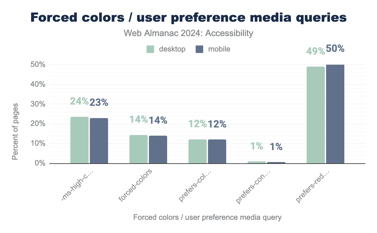
prefers-reduced-motion media query, 12% of sites use prefers-color-scheme, and prefers-contrast is used by just under 1% of desktop and mobile sites.We discovered that over 50% of mobile sites include the prefers-reduced-motion media query, up from 34% in 2022. This is important because digital animations can harm individuals with vestibular disorders; using this query allows for adapting or removing such animations to improve accessibility. Mozilla’s Developer community has some good resources on building motion-sensitive sites.
The Sustainability chapter has some great statistics on the rise in the use of animations, and the impact on digital sustainability.
For contrast, only 12% of desktop and mobile websites utilize the prefers-color-scheme media query, which is up from 8% in 2022. To enhance content readability it is a good practice to allow your users to adjust display modes. The prefers-color-scheme query enables browsers to detect the user’s preferred color scheme, supporting light and dark modes. The prefers-contrast query is valuable for users with low vision or photosensitivity by enabling high contrast modes.
Support for forced-contrast increased about 4% in 2024 to 14% for desktop. Forced Colors Mode is an accessibility feature designed to enhance text readability through improved color contrast. When activated, the user’s operating system takes control of most color-related styles, overriding website color settings. This mode disables common patterns like background images to ensure more predictable text-to-background contrast.
The most well-known implementation is Windows’ High Contrast Mode, now called Contrast Themes. These themes offer alternative color palettes with low and high contrast options, and allow users to customize the system colors to their preference. Use of -ms-high-contrast has decreased slightly in 2024 to about 23%. This can be emulated in Edge and Chrome, so it is now easier to test.
Navigation
When discussing website navigation, it’s crucial to recognize that users may employ a range of methods and input devices. Some might use a mouse to scroll, while others may rely on a keyboard, switch control device, or screen reader to navigate through headings. When designing a website, it’s essential to ensure it functions effectively for all users, regardless of the device or assistive technology they use. Wide-screen TV’s and voice interfaces (like Siri and Amazon Alexa) both place challenges on how we design our navigation. Building a good semantic structure into a site helps screen reader users navigate a site, but also helps users of many other types of technology.
Focus indication
Focus indication is crucial for users who navigate websites primarily using a keyboard and some alternative navigation devices. WebAim has some great resources on assistive technology for individuals with limited motor abilities. These devices are also customized by the user to maximize what they can control. There are a lot of similarities between how visible focus styles and focus order are managed with these devices, but it may be different than for keyboard only users.
Most automated tests do not test for focus order or keyboard traps. Lighthouse can not tell you that your site is keyboard navigable. All it can do is tell you that it isn’t if your site fails some basic tests which are essential. Lighthouse uses Deques’ axe rules to evaluate best practices. Even with a perfect score for focus indication, you need to test your pages manually. Lighthouse recommends testing for:
- Focus traps
- Interactive controls are keyboard focusable
- Logical tab order
- Focus directed to new content on a page
Accessibility Insights is a great open source tool that leverages Deque’s axe. This Chrome/Edge extension can help with keyboard-only testing and guide developers through other tests. The Tab Stops feature is a great visual indicator of a keyboard-only user’s progress through a website.
Focus styles
WCAG mandates a visible focus indicator for all interactive content to ensure users can identify which element is currently focused as they move through a page.
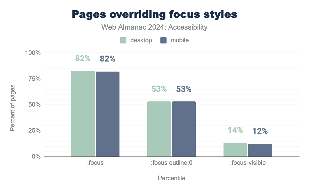
We discovered that 53% of websites apply :focus {outline: 0} (in 2022 it was 86%), which removes the default outline provided by browsers for focused interactive elements. Although some websites implement custom styles to override this, it’s not always the case, making it challenging for users to identify the currently focused element and impeding navigation. Sara Soueidan offers valuable guidance on designing WCAG-compliant focus indicators. On a positive note, 12% of websites now use :focus-visible (up from 9% in 2022 and 0.6% in 2021), which is a pseudo class that uses browser heuristics to determine when to show the focus indicator. This is a significant improvement in accessibility practices.
tabindex
Generally, HTML will have focus order set without having to set the tabindex. CSS and JavaScript often cause changes to how it is presented in the DOM. The tabindex attribute controls whether an element can receive focus and determines its position in the keyboard focus or “tab” order.
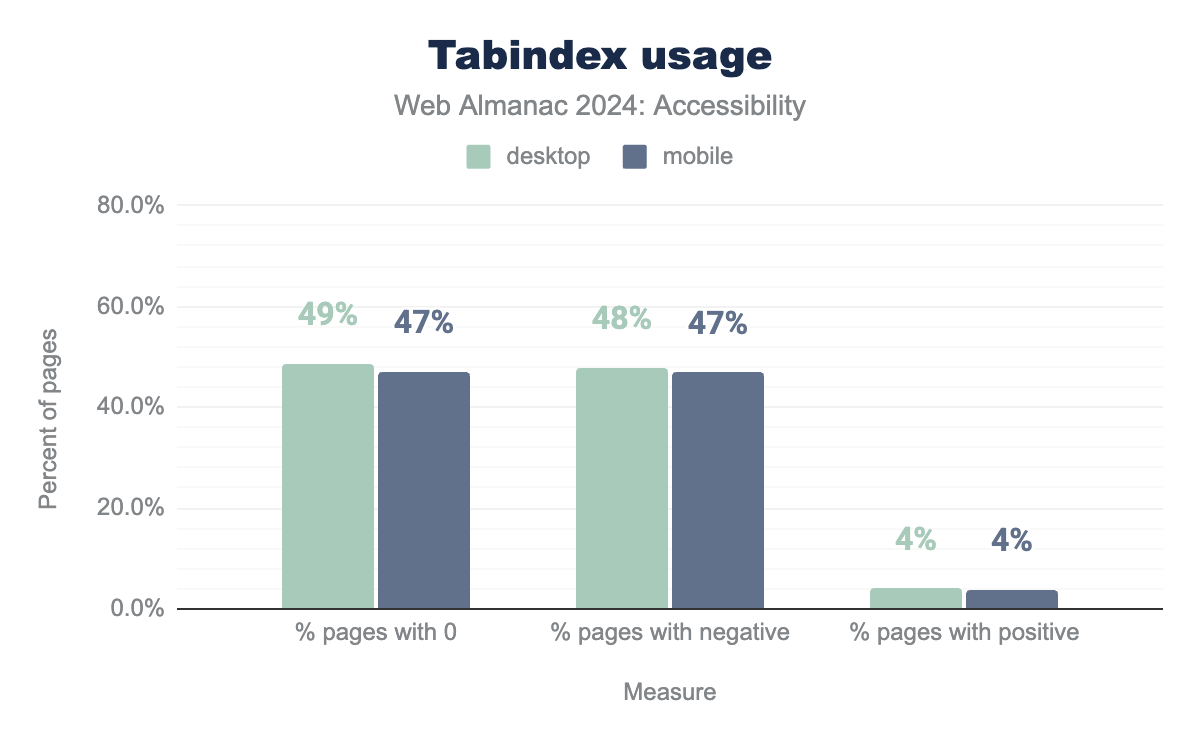
Our analysis shows that 63% of mobile websites and 64% of desktop websites utilize tabindex (up from 60% and 62% respectively). This attribute serves several purposes, which can affect accessibility:
tabindex="0"places an element in the sequential keyboard focus order. Custom interactive elements and widgets should havetabindex="0"to ensure they are included in the focus sequence.tabindex="-1"removes the element from the keyboard focus order but allows it to be focused programmatically via JavaScript.- A positive tabindex value overrides the default keyboard focus order, often leading to issues with WCAG 2.4.3 - Focus Order.
It’s important to avoid placing non-interactive elements in the keyboard focus order, as this can be confusing for screen reader users who can see and alternative navigation users.
Of all websites using the tabindex attribute, 4% employ positive values (down from 7% in 2022). Using positive tabindex values is generally considered poor practice as it disrupts the natural tab order. Karl Groves provides an insightful article on this topic.
Landmarks
Landmarks help structure a web page into distinct thematic regions, facilitating easier navigation for users of assistive technologies. For instance, a rotor menu can help navigate between different page landmarks, while skip links can direct users to specific landmarks, such as <main>. Landmarks can be defined using various HTML5 elements. This semantic structure can also be applied with Web Accessibility Initiative – Accessible Rich Internet Applications (ARIA)’s landmark roles. However, it’s best to use native HTML5 elements whenever possible, in line with ARIA’s first rule.
Although ARIA landmarks have traditionally been only visible to screen reader users, some sites are beginning to use tools like this open source SkipTo script which aggregates headings and landmarks into a page-specific table of contents. Exposing the document structure to the user helps everyone’s comprehension. SkipTo delivers what really should be basic browser functionality. This goes beyond the skip links that are discussed in a later section.
| Element type | % of element | % of role | % of both |
|---|---|---|---|
main |
37% | 17% | 44% |
header |
65% | 12% | 66% |
nav |
66% | 19% | 70% |
footer |
65% | 10% | 67% |
role usage (desktop).
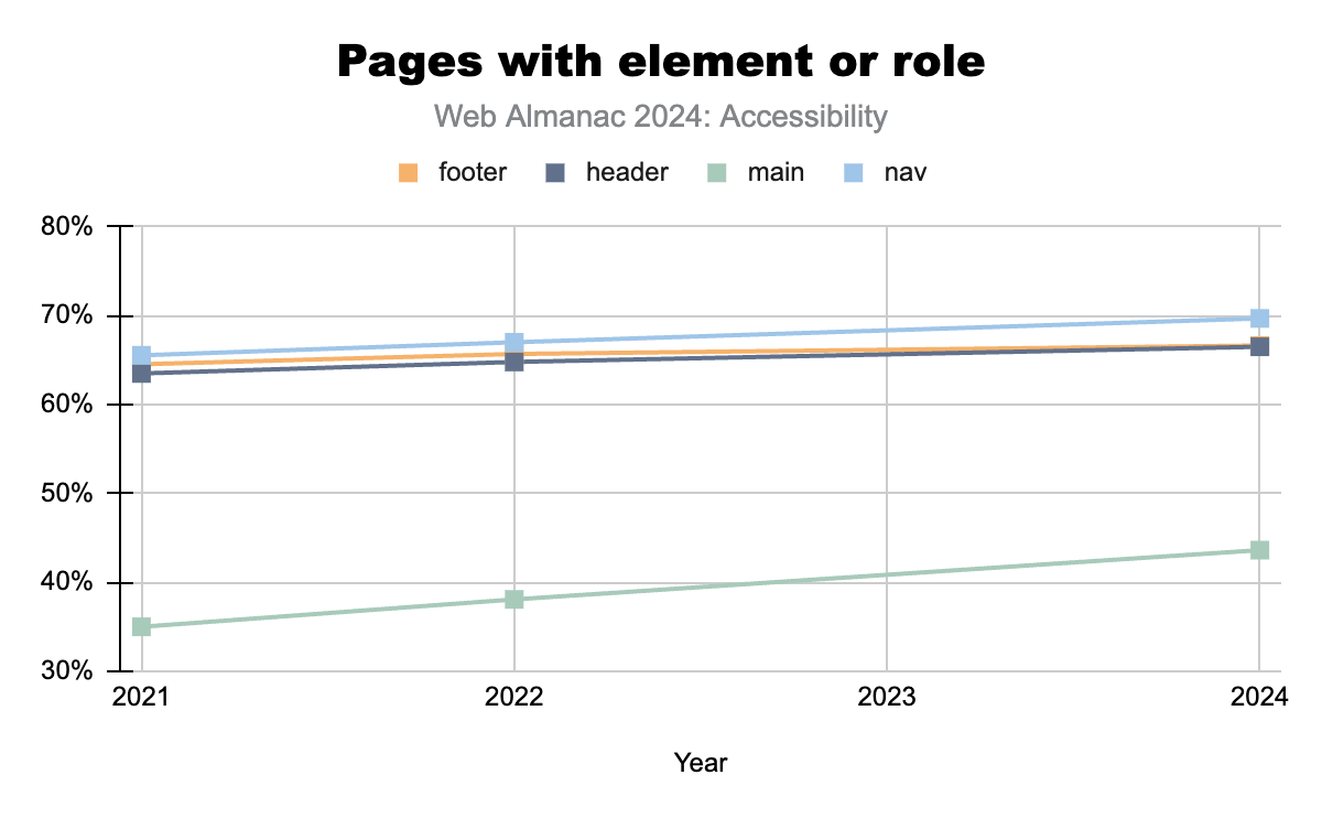
The most commonly expected landmarks for most web pages include <main>, <header>, <nav>, and <footer>. Our findings reveal that:
- only 37% of all pages use the native HTML
<main>element, - 17% of all pages have an element with
role="main", and - 43% are using either one of them (up from 35% in 2021).
Scott O’Hara’s article on landmarks provides valuable insights for enhancing accessibility.
Heading hierarchy
Headings are crucial for all users, including those with assistive technologies, as they aid in navigating a website. Assistive technologies enable users to jump to specific sections of interest. As highlighted in Marcy Sutton’s article on headings and semantic structure, headings function like a table of contents, allowing users and search engines to navigate to particular content areas efficiently.
Sadly the heading hierarchy has gotten worse over the last two years. Lighthouse tracks properly ordered headings and it has dropped just over 1% to:
Heading levels are associated with different font sizes and are frequently misused to visually style a website or mark specific sections rather than structure the content. This misuse negatively impacts both user experience and accessibility tools as well as search engines. CSS should be used to style elements, not heading tags.
WCAG mandates that websites offer multiple navigation options beyond the primary menu in the header, as outlined in Success Criterion 2.4.5: Multiple Ways. For instance, many users, including those with cognitive disabilities, prefer search features to locate pages on large websites.
Currently, 21% of mobile websites and 22% of desktop websites include a search input (down from 23% and 24% respectively in 2022). This is not a good trend.
Skip links
Skip links enable users who rely on the keyboard, switch control devices, or other alternative navigation tools to bypass various sections of a webpage without having to navigate through every focusable element. A common use is to skip over the primary navigation and move directly to the <main> content, particularly on sites with extensive interactive navigation menus. This can dramatically improve the user experience for some users.
We discovered that 24% of both desktop and mobile pages likely include a skip link, helping users to avoid unnecessary parts of the page. This percentage may actually be higher, as our analysis only detects skip links positioned near the top of the page (such as those for bypassing navigation). Skip links can also be used to skip other sections of the page, as we described above with the SkipTo script.
Document titles
Descriptive page titles are important for navigating between pages, tabs, and windows. Assistive technologies, such as screen readers, read these titles aloud, helping users keep track of their location.
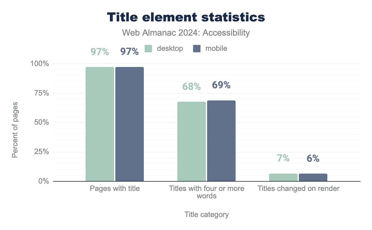
<title> element, 69% of sites of those titles have four or more words, and 7% of desktops and 6% of mobile titles are changed on render.While 97% of mobile websites include a document title, only 69% have titles that are more than four words long. Since our analysis is limited to the home page and a secondary, we have limited insights about the inner pages. We did find that secondary pages were 8% more likely to have descriptive titles of more than four words (78% on average in 2024). Ideally, a title should include both a brief description of the page’s content to enhance navigation and the website’s name.
The titles changed on render value is derived from a comparison of the initial HTML title and the final value of the page after JavaScript has loaded. The data indicates that 7% of desktops sites scanned are dynamically changing the content of the title. Secondary pages are slightly less likely to change the title than the home page.
Tables
Tables present data and relationships using two dimensions. For accessibility, tables need a well-structured format with elements like captions and header cells to help users with assistive technologies understand and navigate the data. A caption, using the <caption> element, is especially important as it provides context for screen readers. Currently, 1.6% of desktop sites use a <caption> (slightly up from 1.3 in 2022), but this is a crucial aspect for making tables more accessible.
| Table Sites | All Sites | |||
|---|---|---|---|---|
| desktop | mobile | desktop | mobile | |
| Captioned tables | 5.5% | 4.8% | 1.6% | 1.5% |
| Presentational table | 4.4% | 5.0% | 3.1% | 4.2% |
Tables don’t need to be used for page layout, thanks to CSS Flexbox and Grid. If necessary, tables can use role="presentation" to explicitly remove semantics and thereby avoid confusion when they are used for layout purposes. We see that 4% of mobile tables use this workaround (versus 1% in 2022).
Forms
Forms are essential for user interactions, such as logging in or making purchases. For users with disabilities, accessible forms are crucial for completing tasks and achieving equal functionality. Forms are also often much more complicated for developers to build than static HTML pages.
<label> element
The <label> element is the preferred way for linking input fields with their accessible names. Using the for attribute to match the id of an input ensures proper programmatic association, improving form usability. Furthermore, when the label element is used properly it allows users to click or tap on the label to focus the form field.
For example:
<label for="emailaddress">Email</label>
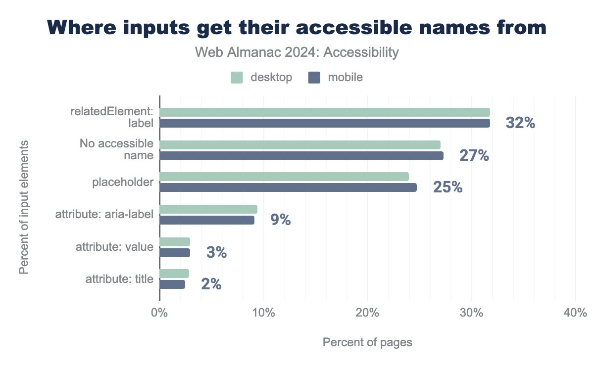
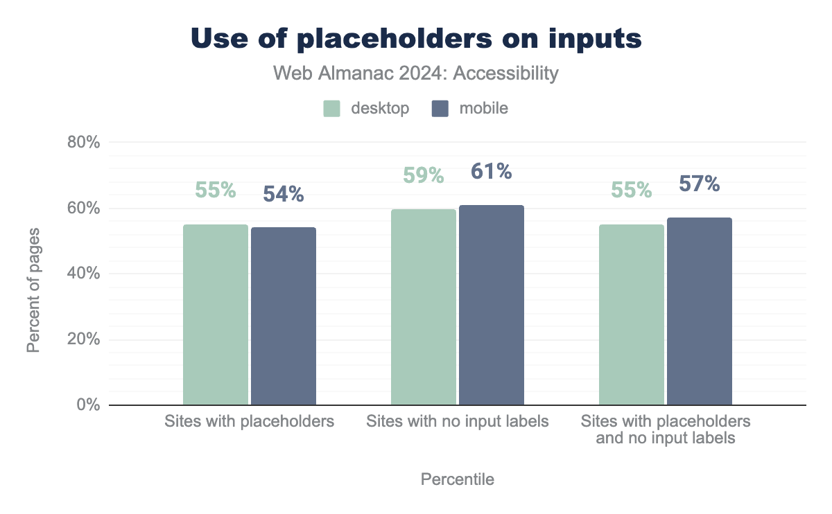
<input type="email" id="emailaddress">label element. 24% of desktops inputs get their accessible names from the placeholder attribute and 25% for mobile. aria-label is responsible for 9%. The value attrabute contributes 3%. A title attribute contributes to 3% of the desktop and 2% of the mobile sites surveyed.Unfortunately, 13% of mobile inputs lack accessible names (a significant improvement from 38% in 2022). Only 15% of mobile sites use <label> (down from 19% in 2022), which can hinder users relying on screen readers or voice-to-text tools. An accessible name always needs to be used and sites should support assistive technology beyond just screen readers by ensuring the accessible name matches the visible label on the input. WCAG 2.1 added 2.5.3 Label in Name (Level A) to help ensure that technologies like Voice Control would be better supported. Use of aria-label and aria-labelledby should only be used if an HTML <label> cannot be used.
placeholder attribute
The placeholder attribute provides example input formats. It should not replace a <label> as a way to provide an accessible name. When placeholders are the only way of providing a visible label, that reference point disappears when the user starts typing. It is not a new concern that browsers by default do not give placeholder text sufficient contrast to meet WCAG. Furthermore, they are not always supported by screen readers. A better solution is to show example input formats below or beside the input and connect them to the input programmatically using aria-describedby.
57% of mobile sites and 55% of desktop sites use placeholders alone, which can lead to accessibility issues. As per HTML5 guidelines, placeholders should not replace labels for accessibility.
Use of the placeholder attribute as a replacement for a label can reduce the accessibility and usability of the control for a range of users including older users and users with cognitive, mobility, fine motor skill or vision impairments.
Requiring information
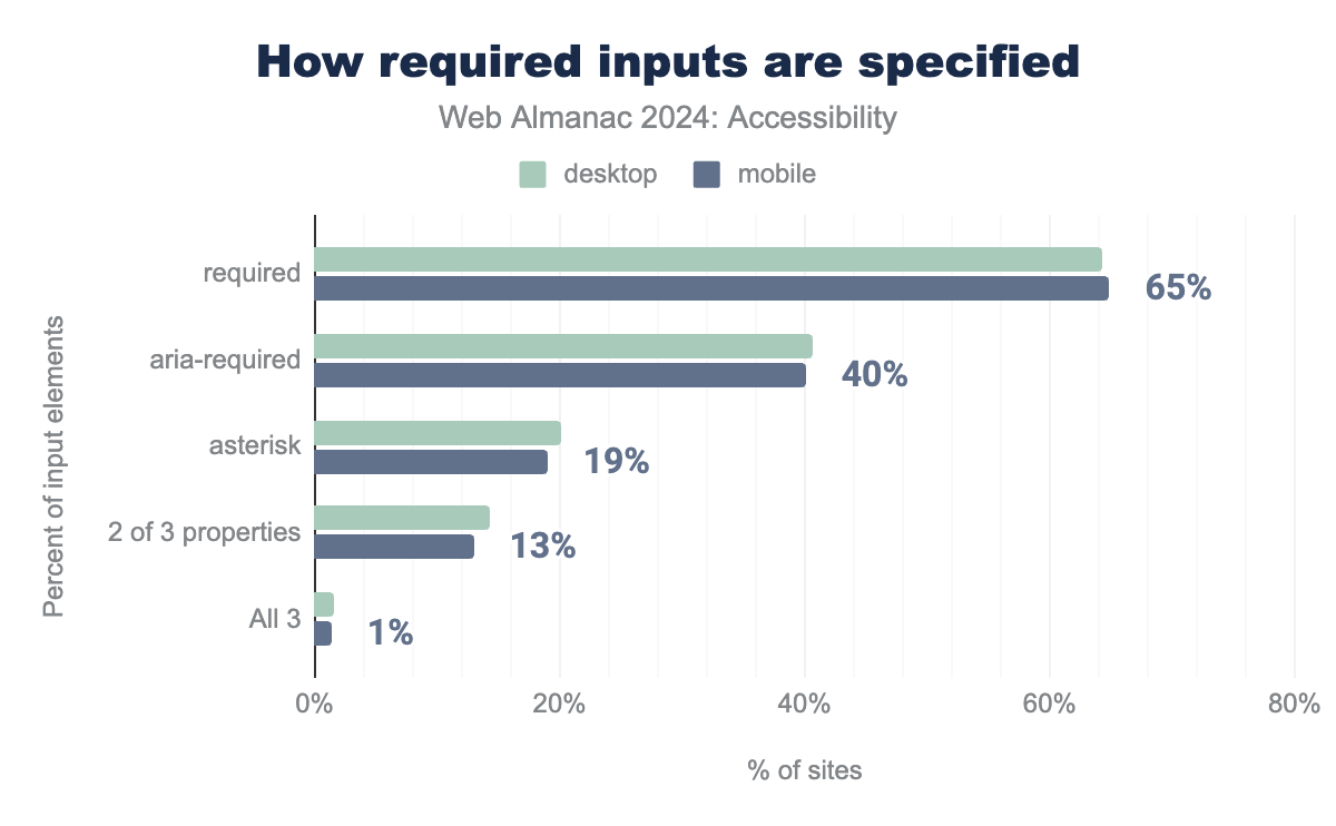
Indicating required fields is crucial for forms. Before HTML5, an asterisk (*) was commonly used, but it’s only a visual cue and doesn’t provide error validation. In addition, the required attribute in HTML5 and aria-required attribute can improve the semantics for indicating mandatory fields.
aria-required is used by 41% and 40%, asterisk is used by 20% and 19%, 2 of 3 of these implemnted 14% and 13%, and all three are used by 2% on desktop and 1% on mobile.Currently,
- 65% of mobile sites use the required attribute (down from 67% in 2022), and
- 40% use
aria-required(up from 32% in 2022), but - 19% still rely only on an asterisk (which is down from 22% in 2022).
This should be avoided unless supplemented by required and aria-required.
Captchas
Websites often use CAPTCHAs to verify that a visitor is human and not a bot. CAPTCHAs, which stands for “Completely Automated Public Turing Test to Tell Computers and Humans Apart,” are commonly used to prevent malicious software.
These tests can be challenging for everyone, especially for those with low vision or reading disabilities. The W3C has suggested alternatives to visual CAPTCHAs, which are worth exploring.
Media on the web
Accessibility of media is crucial. People with disabilities need alternative methods to understand and interact with media content. For example, blind users require audio descriptions for images or videos, while those who are deaf or hard of hearing need sign language or captions.
Transcripts are needed for audio only and video only content. Non-text content such as images need equivalent alternatives or if they are just decorative they need to be semantically marked as such.
A media player is often embedded in the page to allow a user to play the audio or video content directly inline. If this is the case, it is important that an accessible player, such as the open source Able Player, is used.
Images
Images can have an alt attribute that provides a text description for screen readers. 69% of images passed the Google Lighthouse audit for images with alt text (up from 59% in 2022). Which is a notable increase, especially because the number only increased about 1% from 2021 to 2022.
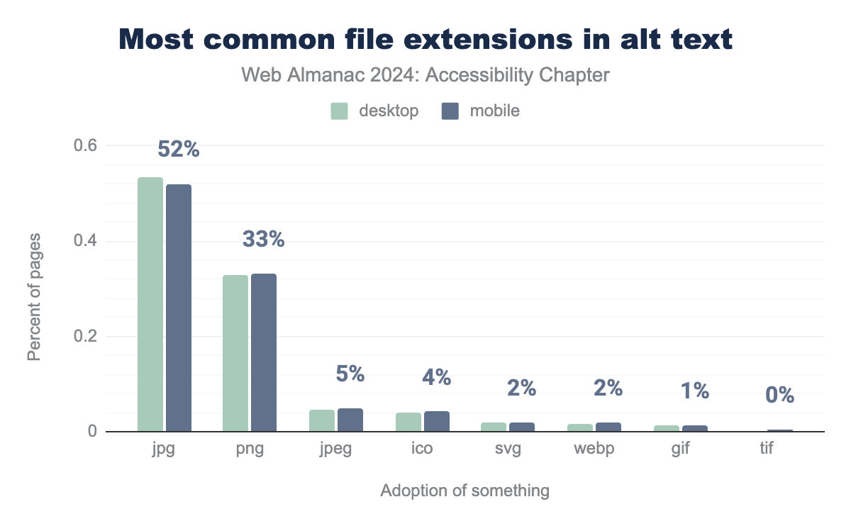
The alt text should reflect the image’s context. For decorative images, alt="" is appropriate, while meaningful images require informative descriptions. It’s also important to avoid using file names as alt text, as it almost never provides relevant information. Currently 7.5% of mobile and 7.2% of desktop sites currently do.
The most common file extensions found in alt text values (for sites with non-empty alt attributes) are jpg (and jpeg), png, ico, and svg. This likely indicates that CMS or other content management systems either automatically generate alt text or require content editors to provide it. However, if the CMS merely includes the image filename in the alt attribute, it typically offers no benefit to users. Therefore, it’s crucial to use meaningful text descriptions.
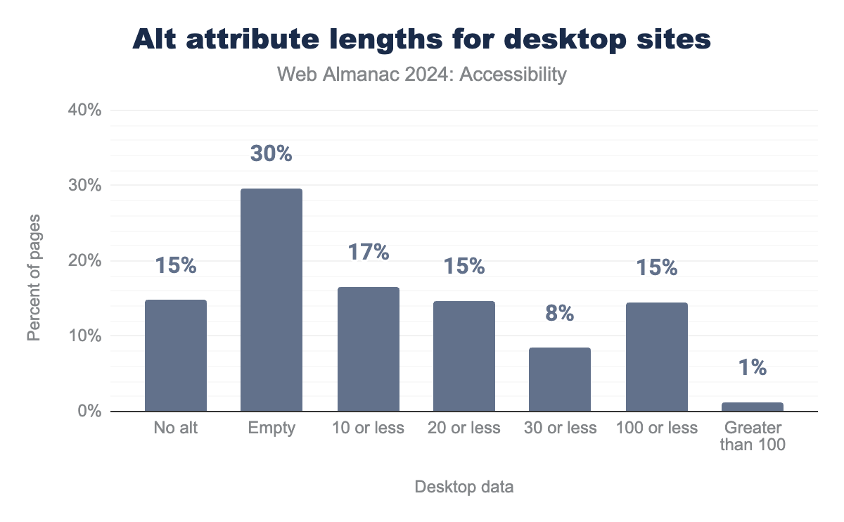
alt attribute lengths.
There is a slight decline in images with no alt text currently at 15%, down 3% from the 2022 values. We discovered that 30% of alt text attributes on both desktop and mobile sites are empty, up from 27% in 2022. An empty alt attribute should be used only for images that are purely decorative and do not need to be described by screen readers or other assistive technologies. Most images contribute to the page content, so they should generally include a meaningful description.
Unfortunately, 17% of alt attributes contain 10 or fewer characters, this is down one percent from 2022. These unusually brief descriptions suggest inadequate information to describe the image appropriately. While some of these may be used to label links, which is acceptable, many lack sufficient descriptive content.
There is certainly more that can be done to change these stats. Very few content tools support authors through better documentation and validation as suggested in Authoring Tools Accessibility Guidelines (ATAG) 2.0. Increasingly people are looking at Artificial Intelligence (AI) to create the alt text, usually on the client side. Brian Teeman wrote an interesting critique of the AI generation of Alt Text.
One promising approach is from Mike Feranda in Drupal who has incorporated AI into CKEditor with AIDmi. By showing authors an example of what the alt-text could be, they may be more likely to edit it to have it reflect what they are trying to say. This approach could be applied to other editing tools.
Audio and video
The <track> element is used to provide timed text for <audio> and <video> elements, such as captions and descriptions. This helps users with hearing loss or visual impairments understand the content.
<audio> elements include a <track> element.
For <video> elements, the figure is slightly higher at 0.5% for both desktops and 0.65% for mobile sites. These statistics do not cover audio or video embedded via <iframe>, where third-party services are less likely to offer text alternatives. Our industry can do a lot better.
Assistive technology with ARIA
Accessible Rich Internet Applications (ARIA) provides a set of attributes for HTML5 elements designed to enhance web accessibility for individuals with disabilities. However, excessive use of ARIA attributes can sometimes create more problems than it solves. ARIA should be employed only when native HTML5 elements are inadequate for ensuring a fully accessible experience and should not replace or be used beyond what is necessary.
ARIA roles
When assistive technologies interact with an element, the element’s role helps convey how users might engage with its content.
For instance, tabbed interfaces often require specific ARIA roles to accurately represent their structure. The WAI-ARIA Authoring Practices Design Patterns outline how to create an accessible tabbed interface, suggesting that a tablist role be assigned to the container element due to the absence of a native HTML equivalent.
HTML5 introduced numerous native elements with built-in semantics and roles. For example, the <nav> element inherently has a role="navigation", making it unnecessary to explicitly add this role with ARIA.
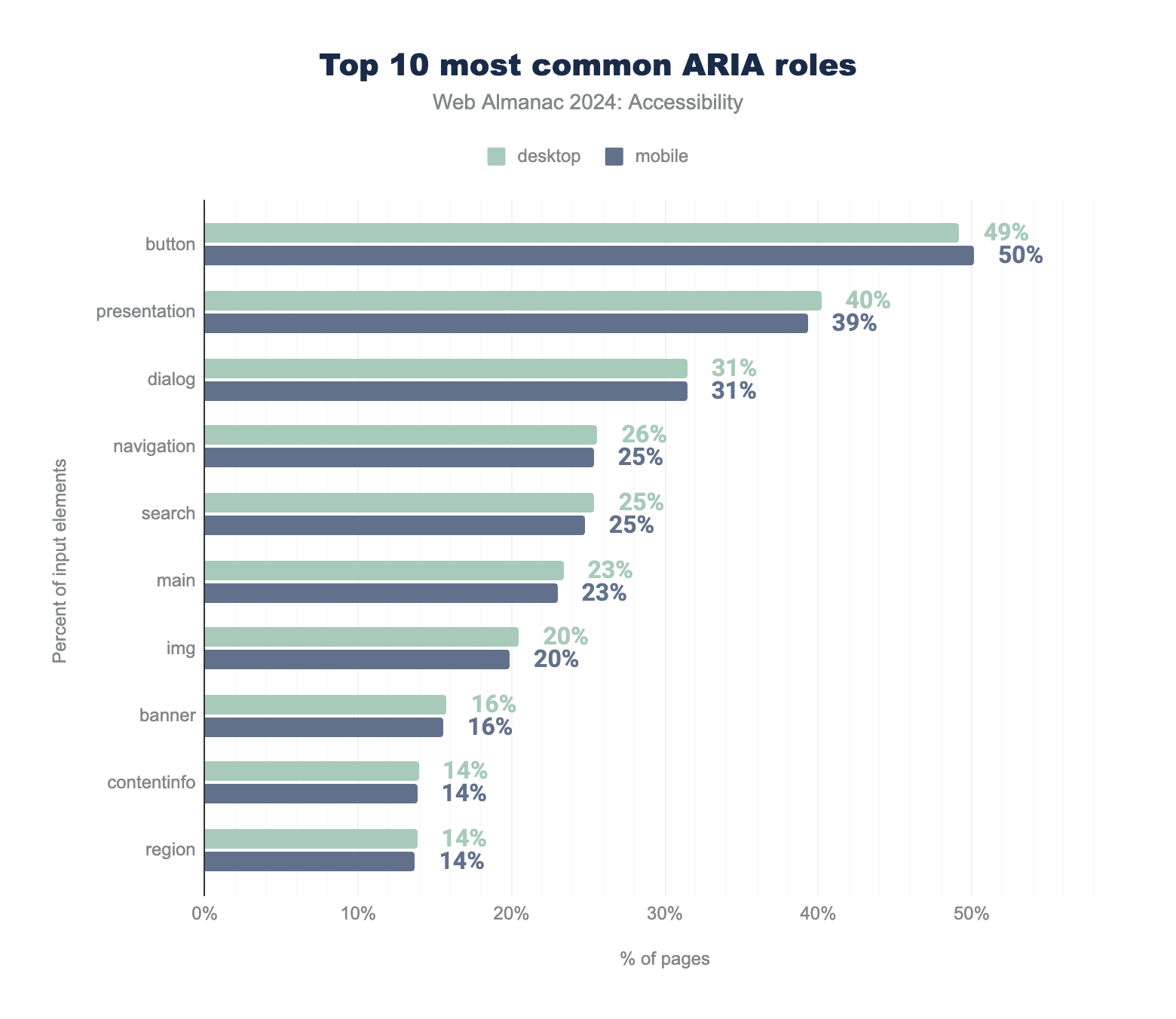
We observed that over 50% of mobile sites had home pages with at least one element assigned the role="button" (up from 33% in 2022, and 29% in 2021 and 25% in 2020). This increase is concerning, as it suggests websites may be using <div> or <span> elements as custom buttons or redundantly applying roles to <button> elements. Both practices are problematic and violate the fundamental ARIA principle of using native HTML elements—such as <button>—whenever possible.
role="button".
18% of websites have at least one link with role="button" (slightly down from 21% in 2022). While adding an ARIA role can inform assistive technologies about an element’s purpose, it doesn’t make the element function like its native counterpart. This discrepancy can lead to issues with keyboard navigation since links and buttons have different behaviors. For example, links are not activated by the space key, whereas buttons are.
Using the presentation role
When an element is assigned the role="presentation", it loses its inherent semantics, along with those of its required child elements (e.g., list items within a <ul>, or rows and cells within a table). For instance, applying role="presentation" to a parent <table> or <ul> element will propagate this role to its child elements, causing them to lose their table or list semantics.
Removing semantics with role="presentation" means the element only has visual presence and its structure is not recognized by assistive technologies. The element’s content will be read by a screen reader, but no information about the semantics will be provided.
role="presentation".
This is concerning as in 2022 it was already high at 25% of desktop sites and 24% of mobile sites.
Similarly, using role="none" also removes the element’s semantics. This year, 5% of sites used role="none", down from 11% in 2022. While it may be useful in rare cases, such as when a <table> is used purely for layout, it generally should be used cautiously as it can be detrimental to accessibility.
Most browsers disregard role="presentation" and role="none" when exposing a role in the accessibility tree for focusable elements, including links and inputs, or elements with a tabindex attribute. Similarly, if an element with these roles includes global ARIA states or properties (such as aria-describedby), the presentation and none roles may be ignored.
Labeling elements with ARIA
In addition to the DOM, browsers have an accessibility tree, containing details about HTML elements such as accessible names, descriptions, roles, and states. This information is communicated to assistive technologies through accessibility APIs.
An element’s accessible name can come from its content (e.g., button text), attributes (e.g., image alt attribute), or associated elements (e.g., a label linked to a form control). There is a hierarchy used to determine the source of the accessible name when multiple sources are available. For further reading on accessible names, Léonie Watson’s article, “What is an accessible name?” is a valuable resource.
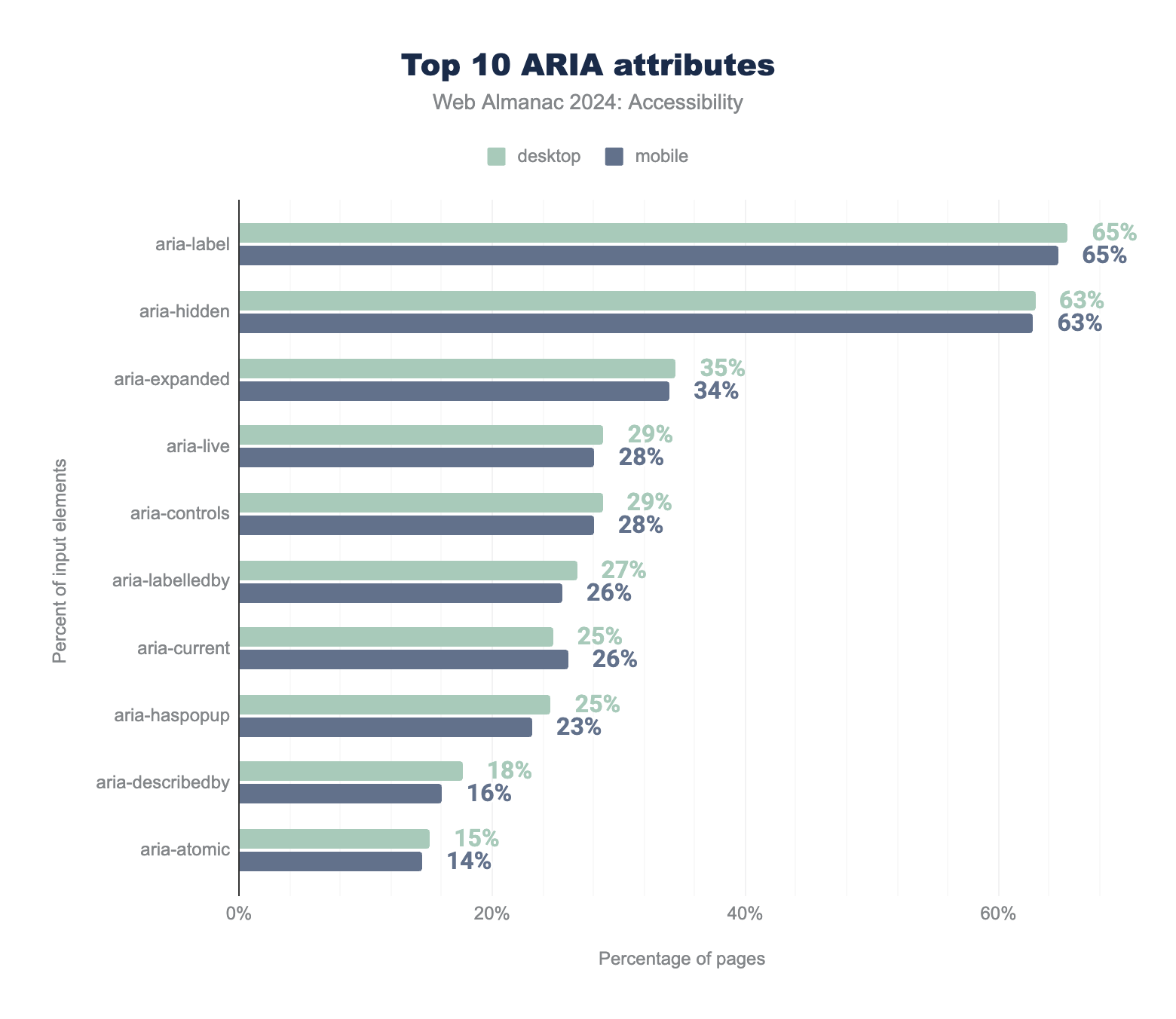
aria-label is used by 65% of sites, aria-hidden by 63%, aria-expanded by 35% and 34%, aria-live by 29% and 28%, aria-controls by 29% and 28%, aria-labelledby by 27% and 26%, aria-current by 25% and 26%, aria-haspopup by 25% and 23%, aria-describedby by 18% and 16%, and finally aria-atomic by 15% and 14%.Two ARIA attributes that aid in assigning accessible names are aria-label and aria-labelledby. These attributes are given precedence over natively derived accessible names and should be used sparingly and only when necessary. Testing accessible names with screen readers and involving individuals with disabilities is crucial to ensure that the names are helpful and do not hinder accessibility.
We observed that almost 66% of pages evaluated featured at least one element with the aria-label attribute (up from 58% for desktop and 57% on mobile in 2022), making it the most frequently used ARIA attribute for accessible names. Additionally, 27% of desktop pages and 25% of mobile pages had at least one element with the aria-labelledby attribute (both are up 2% from 2022 data). This trend suggests that while more elements are being assigned accessible names, it might also indicate a rise in elements lacking visual labels. This can be challenging for users with cognitive disabilities and voice input users.
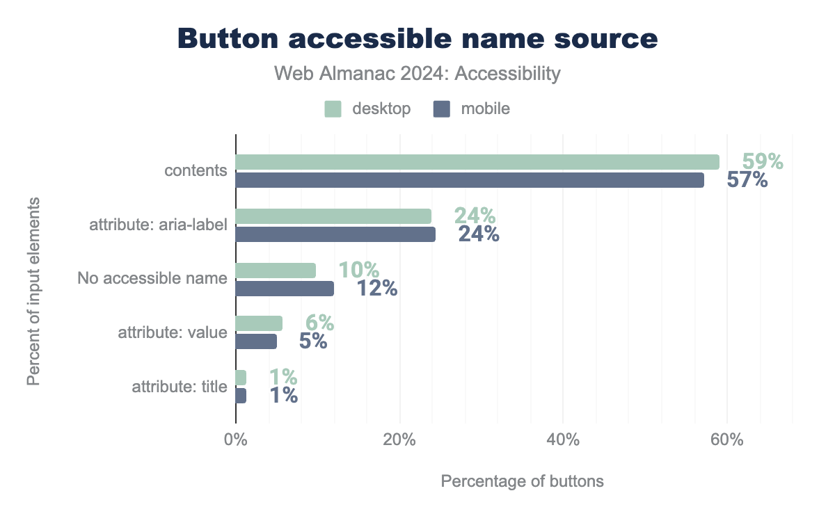
aria-label attribute is used for 24%, there is no accessible name for 10% and 12%, the value attribute is used for 6% and 5%, title attribute is used for 1% on both.Buttons typically receive their accessible names from their content or ARIA attributes. According to ARIA guidelines, it’s preferable for an element to derive its accessible name from its content rather than an ARIA attribute if possible. We found that 59% of buttons on desktop obtain their accessible names from their text content, a slight drop from 2022 when it was 61%. Use of the aria-label attribute is up slightly to 23.9% on desktop (from 20% in 2022) meaning more sites are using the aria-label attribute for their accessible names.
In some cases, aria-label is useful, such as when multiple buttons have the same content but different functions, or when a button contains only an image or icon.
Hiding content
Sometimes, visual interfaces include redundant elements that aren’t beneficial for users of assistive technologies. In these cases, aria-hidden="true" can be used to hide elements from screen readers. However, this approach should not be used if removing the element would result in less information for screen reader users compared to what is presented visually. Hiding content from assistive technologies should not be a way to bypass content that is difficult to make accessible.
aria-hidden attribute.
Using this attribute to hide and show semantic content is a common practice in modern interfaces in order to indicate when content is hidden to the accessibility API. . An example of this is a accordion component where content under a list of headings is hidden until a user selects one of the headings to show the related content.
ARIA can have a huge impact on accessibility and needs to be used cautiously. It’s crucial to apply ARIA correctly to convey the right message.
For instance, disclosure widgets should use the aria-expanded attribute to signal to assistive technologies when an element is revealed or hidden by expanding or collapsing. We observed that 34% of mobile pages had at least one element with the aria-expanded attribute, which is up almost 5% from 2022.
Screen reader-only text
A common approach developers use to provide extra information for screen reader users involves hiding text visually with CSS while keeping it accessible to screen readers. This CSS technique ensures that the text is included in the accessibility tree but remains hidden from sight.
The sr-only and visually-hidden class names are frequently used by developers and UI frameworks to create text that is only accessible to screen readers. For instance, Bootstrap and Tailwind include sr-only classes for this purpose. We found that 16% of desktop pages and 15% of mobile pages used one or both of these CSS classes (each up a percentage point from 2022). It’s important to note that not all screen reader users are visually impaired, so relying too heavily on screen reader-only solutions should be avoided. When this technique is used with an interactive element’s accessible name, it can make it difficult for people who use their voice to control their computer to know what command to give to interact with the element.
Dynamically-rendered content
Sometimes, it’s necessary to inform screen readers about new or updated content in the DOM. For example, form validation errors should be communicated, while a lazy-loaded image might not need to be announced. Updates to the DOM should be made in a non-disruptive manner.
aria-live.
ARIA live regions enable screen readers to announce changes in the DOM. We found that 29% of desktop pages use live regions with the aria-live attribute (up from 23% in 2022) and 28% of mobile pages use aria-live (up from 22% in 2022). Additionally, pages use ARIA live region roles with implicit aria-live values:
| role | desktop | mobile | Implicit aria-live value |
|---|---|---|---|
status |
9.2% | 8.7% | polite |
alert |
6.9% | 6.7% | assertive |
timer |
0.8% | 0.8% | off |
log |
0.6% | 0.6% | polite |
marquee |
0.1% | 0.1% | off |
aria-live value.
For more details on live region variants and their usage, check the MDN live region documentation or explore this live demo by Deque.
User Personalization Widgets and Overlay Remediation
Users are increasingly used to seeing accessibility widgets on websites. These allow them to access accessibility features that improve their experience. Accessibility Overlays are one type of these and usually include two types of technology: a personalization widget and a JavaScript overlay. Overlays can be either generic or custom:
- User personalization: tools that enable the site visitor to make changes to the appearance of the site via an on-site menu — changes like font or color contrast adjustments, and
- Automated overlay remediation: a generic technology that automatically scans for and attempts to remediate many common WCAG issues which affect the user interface, with complex algorithms and/or Artificial Intelligence.
- Custom overlay remediation: site specific code written by expert developer(s) to address specific conformance needs, and verified by accessibility experts in context, to avoid conflict with assistive technology.
Browsers have great built-in tools for personalization, but many users do not know about them. Some sites add personalization widgets that often provide a range of accessibility features to make customization easier. Often this includes font size, spacing, and contrast, which is included in the browser. This may also include tools like text to speech, which is included in Edge. This can be useful for a range of users, but especially for those that do not have their own assistive technology available in that environment. These widgets can be helpful for users who are not actively using assistive technology or already maximizing their browser’s built-in accessibility features.
If used, it is important that these tools do not interfere with the user experience (UX) including that of assistive technology users. For that reason, the European Disability Forum (EDF) published a report clearly stating that Accessibility overlays don’t guarantee compliance with European legislation:
“Users of assistive technology already have their devices and browsers configured to their preferred settings. The overlay technology can interfere with the user’s assistive technology and override user settings, forcing people to use the overlay instead. This makes the website less accessible to some user groups and may prevent access to content.”
Overlay remediations are the second type of technology often found in an overlay product. Automated overlay remediation continuously tries to find and address common WCAG issues as the page is being rendered in the browser. Custom overlay remediations can also be written in JavaScript to overcome accessibility barriers, especially when there is legacy code which can no longer be updated. With good manual testing, especially with users with disabilities, a custom overlay can be an effective solution.
There are many documented reports of popular automated overlays making a product less accessible for some users.
This technology can address some common barriers for some users, making the site more accessible. Automated overlays can also advance an organization’s accessibility progress and path to compliance by freeing development teams to focus on more complex issues that can only be resolved by addressing the design or source code.
Unfortunately, many teams simply stop investing in accessibility after investing in an overlay.
This technology does not replace the need for good accessibility practices. Accessibility needs to be included in all stages of the product life cycle. Overlays are always going to have more usability, security and performance problems than simply fixing the errors at the source. It is important to remember that no automated tool can make a website fully accessible or WCAG compliant.
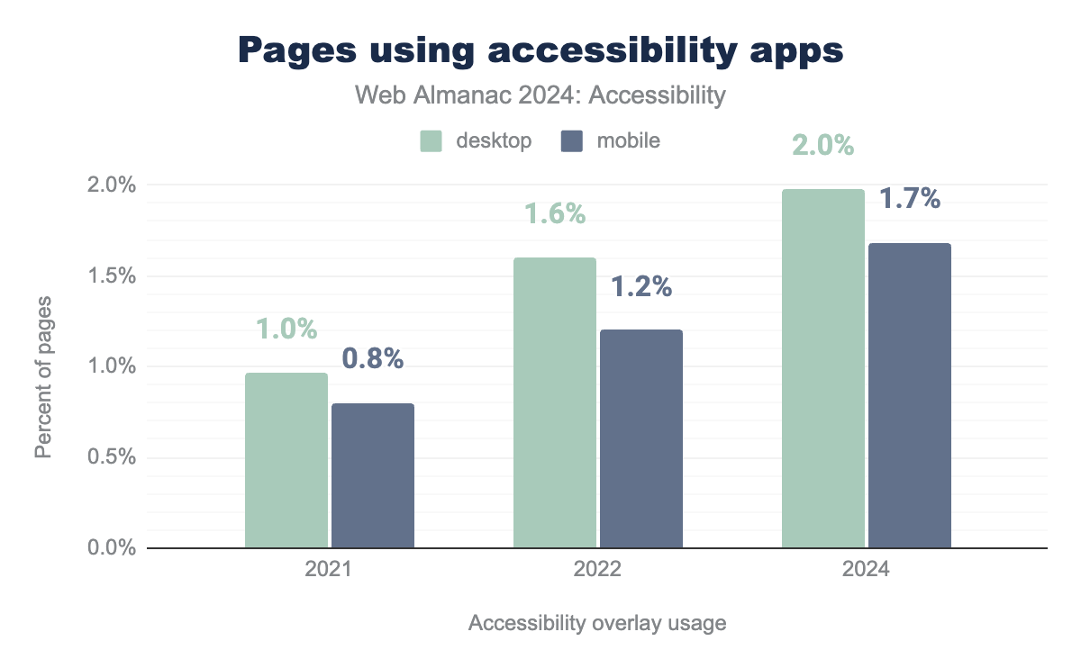
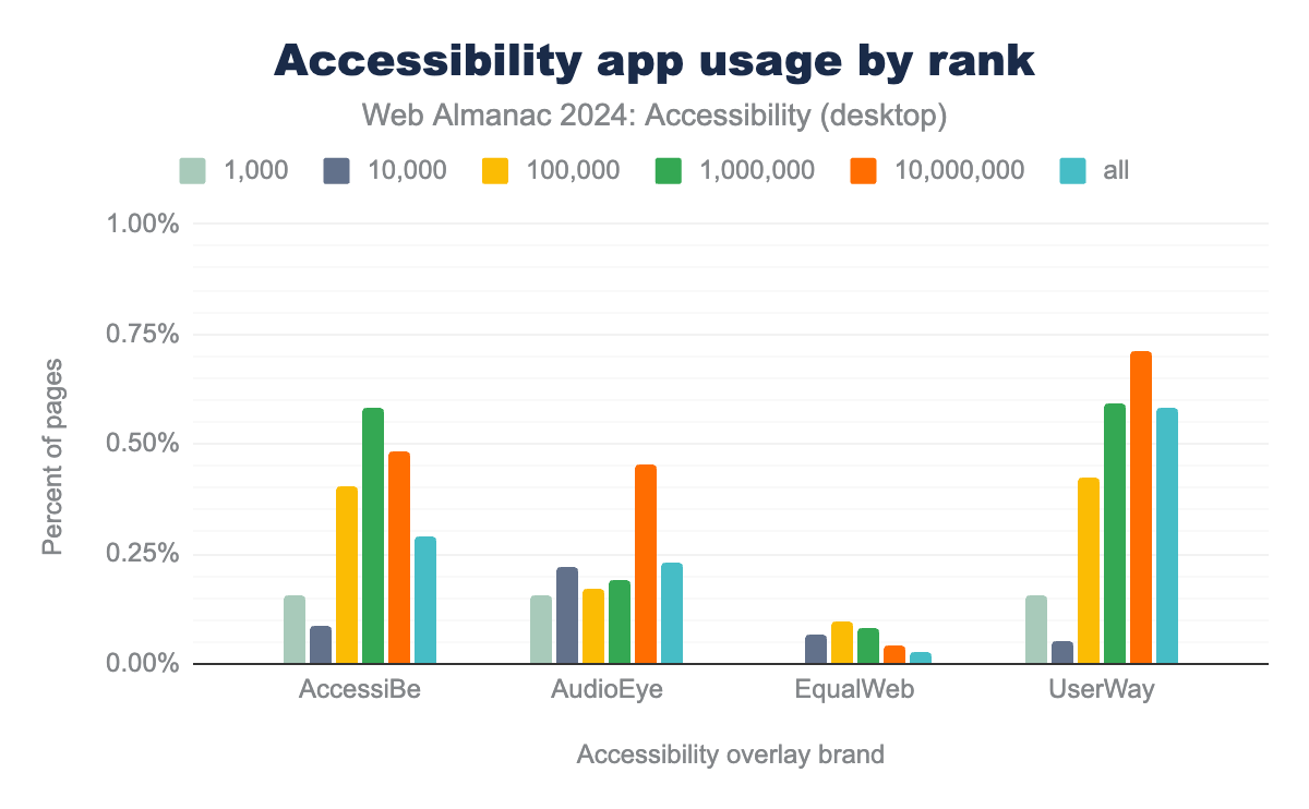
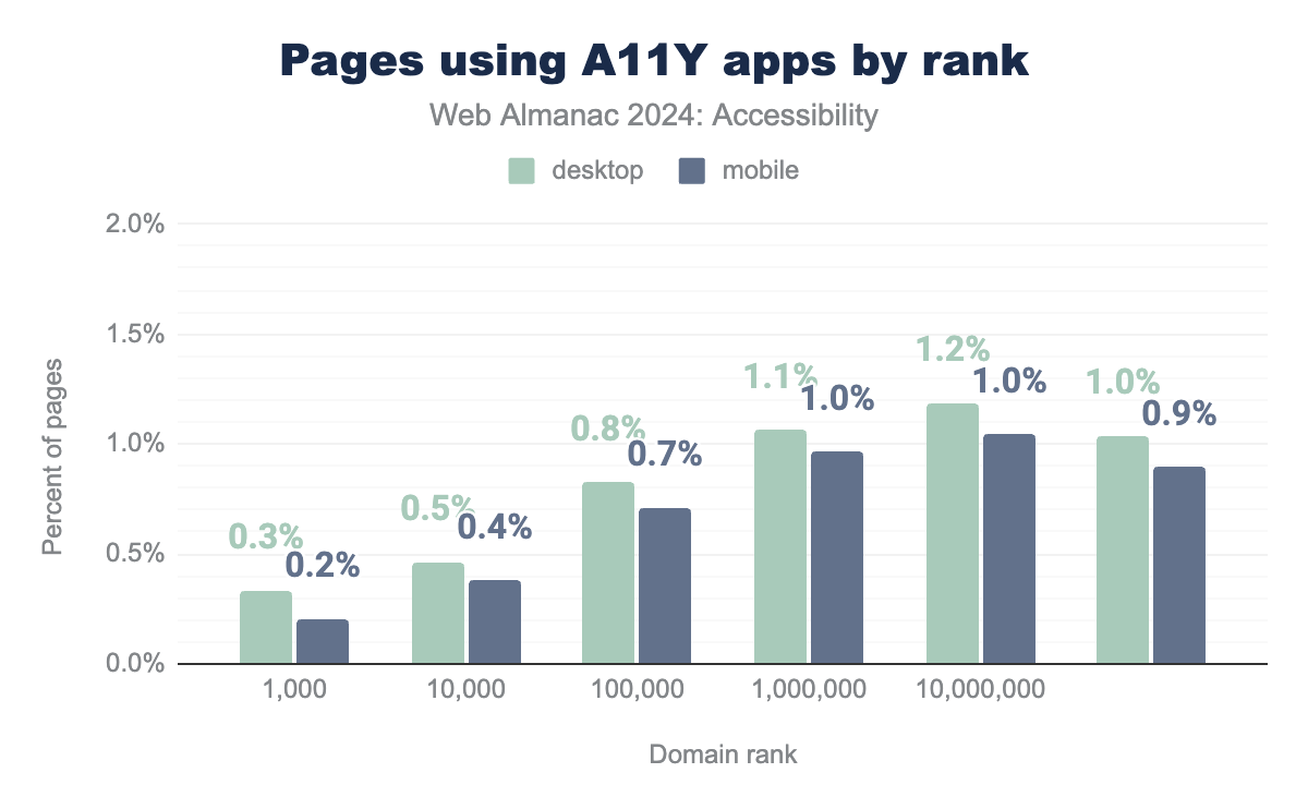
In 2024, we observed that almost 2% of desktop websites utilize known accessibility apps. While not all of these products are accessibility overlays, the detectable overlays show a similar growth trend.
UserWay is the most widely used overlay in our dataset.
These solutions are generally used less for high-traffic websites. For sites ranked in the top 1,000 by visits, only 0.2%, use an overlay.
Confusion on Overlays
The International Association of Accessibility Professionals (IAAP) published a paper outlining its Accessibility Overlay Position and Recommendations. In it, IAAP stresses that overlay technology must never impede a user’s access. Furthermore, it states that IAAP members must not support claims that imply a website or application can be made fully accessible with overlay technology.
False advertising claims made by many overlay providers have prompted outcry from accessibility advocates: Adrian Roselli’s #accessiBe Will Get You Sued initially published in 2020 but actively updated as the case evolved; Lainey Feingold’s American legal perspective.
It is important to clearly understand the capabilities and limitations of any tool or technology used to advance accessibility. False claims by companies about their abilities have confused many clients. Organizations are responsible for doing appropriate research to ensure they meet applicable accessibility requirements and provide the best experience to visitors.
Neither the EU Commission or the US Department of Justice (DOJ) state how web accessibility standards have to be met—just that they must be met. From the DOJ ADA Title II rulemaking the rule “does not address the internal policies or procedures that public entities might implement to conform to the technical standard under this rule.”
In some instances, a combination of overlays and manual expertise has the potential to accelerate accessibility improvements.
Sectors and accessibility
This year we are providing a series of new data comparisons. We want to highlight that there are discernible differences in how different communities have handled accessibility. Whether it is based on good governance, or good defaults, it is possible to see differences in accessibility that are significant. It is the hope of the authors of this section that this will prompt a review of how the various communities treat accessibility.
We also asessed the accessibility of websites in this section using the open source tool, Google Lighthouse.
Country
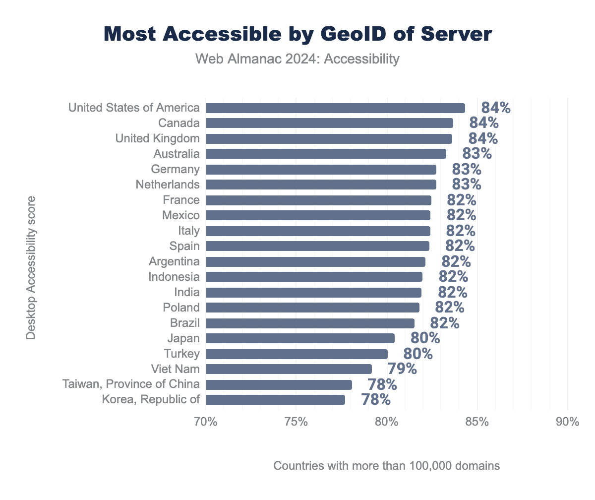
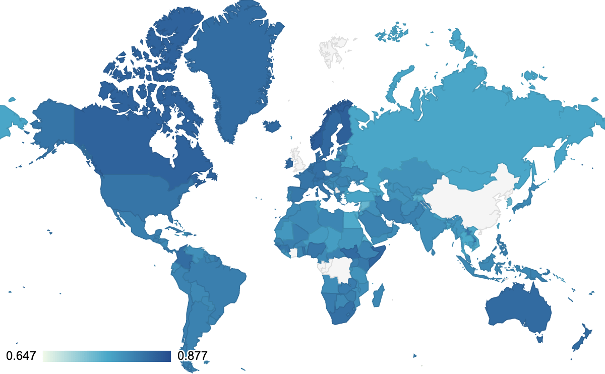
There are two means by which we can identify country information, first by the GeoID of the server, and the second by the Top Level Domain. Because of the price of hosting in different countries, some are much better represented by GeoID than others. Likewise, given that many domains can operate independently of the country like the .ai or .io domain, we can’t assume that all .ca, .es, or .fi domains are located in Canada, Spain or Finland.
It is worth noting that many sites that operate in the USA are subject to the Section 508 guidelines on accessibility. Organizations are being sued in the USA, under ADA Title III, for not having accessible websites. It is not surprising that the USA is the most accessible country. Other jurisdictions are beginning to penalize companies that sell inside their geography or to their citizens. Increasingly people are looking at the European Accessibility Act and preparing for the new requirements that will be introduced in 2025.
The following map shows the average desktop accessibility score by country top level domain (TLD).
But it is a bit easier to see the TLD ranked and including the non-country codes as well.
As with the prior chart .edu and .gov domains are the most accessible. The US Government under Section 508 and Section 504, have had this as part of their mandate for more than two decades. Early accessibility legislation and active lawsuits have driven accessibility adoption in the United States. Countries outside the USA started providing legislation and enforcement measures for WCAG conformance later. Lainey Feingold maintains a great list of global law and policy.
Government
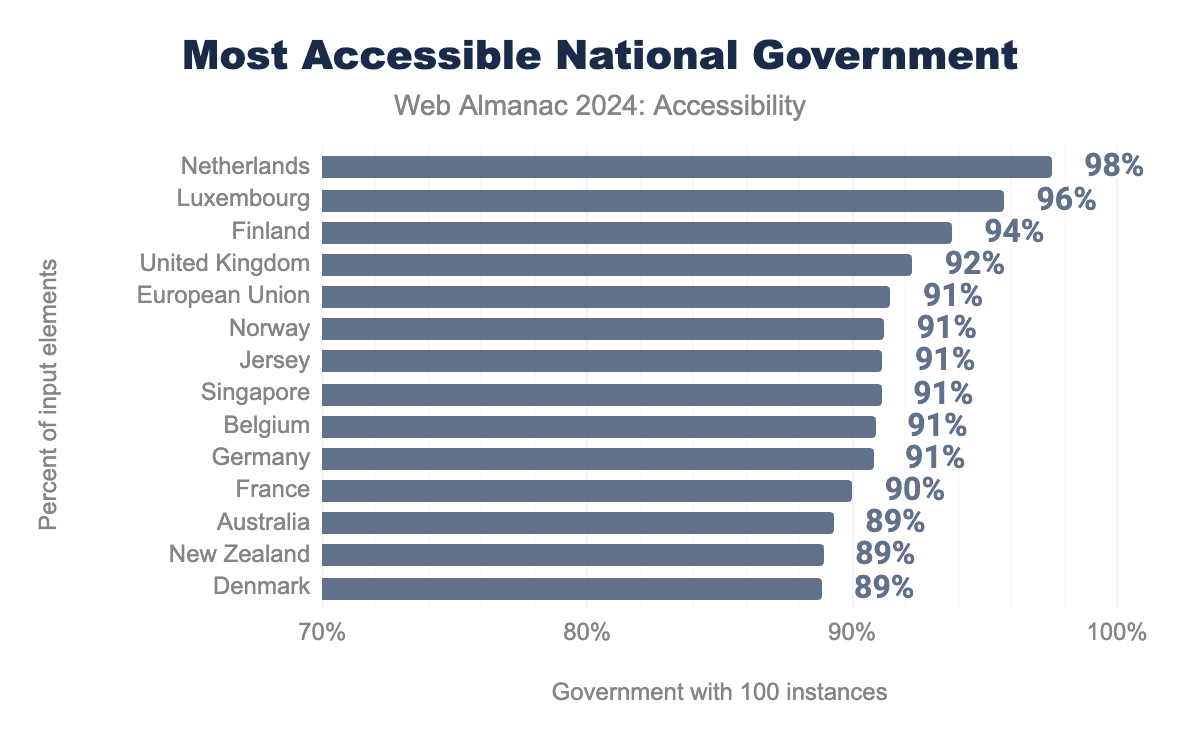
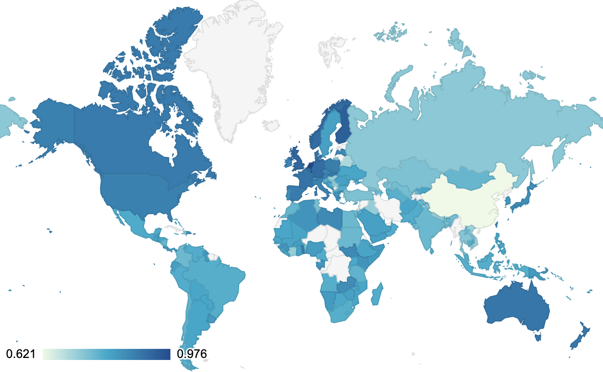
Not all government domains follow consistent accessibility rules, however we were able to isolate many countries’ government sites. Some countries are inconsistent about naming government sites, so there will be exceptions which are not covered. We have collected averages for most government agencies around the world.
Most modern governments have committed to either WCAG 2.0 AA or WCAG 2.1 AA. It is clear that the implementation of these policies isn’t being equally delivered. This is particularly important when looking into accessibility within the European Union where each member state needs to implement legislation based on the Web Accessibility Directive. It should be possible to compare the 3-year EU member state reports with the values provided here and in future Web Almanacs. It is worth noting that the average for the United States is 87%.
The Netherlands (98%) are firmly in the lead, followed by Luxembourg (96%) and Finland (94%). The United Kingdom and the Netherlands both have a standardized design system which is prioritizes accessibility. What contributes to Luxembourg and Finland’s success? Considering that most accessibility content is available only in English, has this reduced adoption by some governments?
Government domains were largely found based on domain name pattern matching. There are a lot of inconsistencies in how governments use domain names, but there is enough information here to provide comparisons. It is worth noting that .gov covers all levels of the US government, so we have tried to filter out those state specific sub domains except in the state specific reporting. In this report, we could not filter out municipal or regional .gov sites. When looking at the TLD .gov domain chart above the average was 87%.
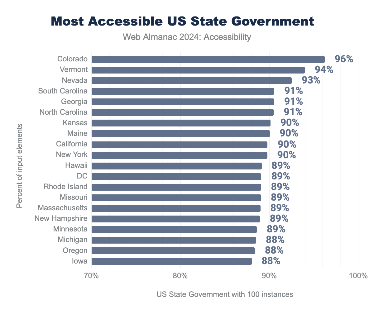
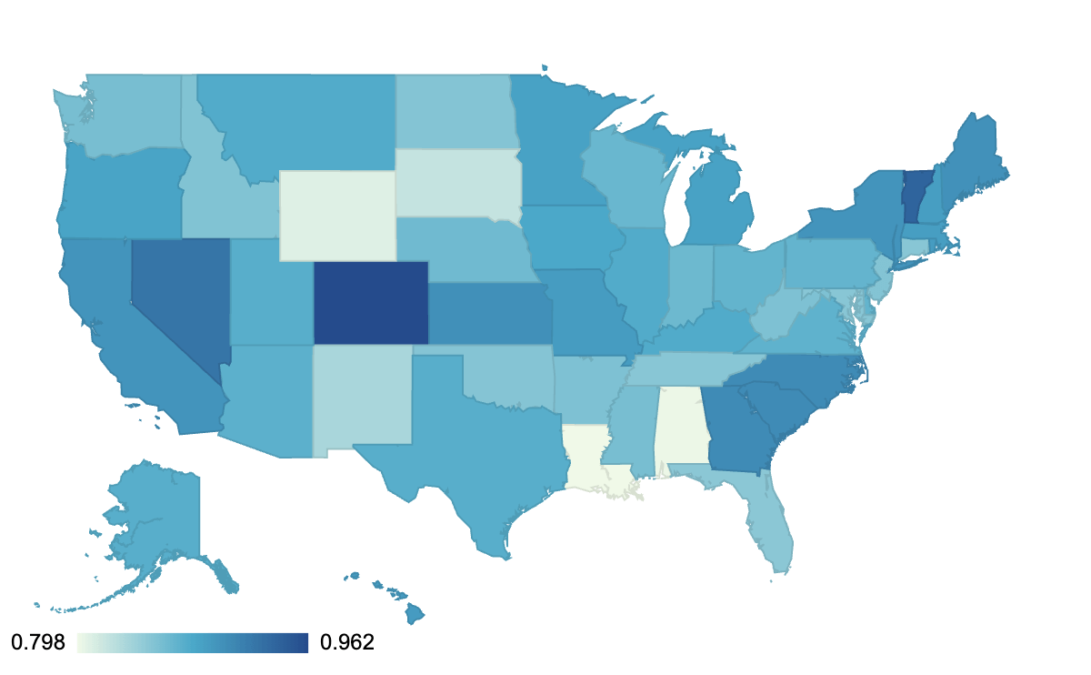
We can also review the accessibility of various states.
Again, Colorado and Vermont are much further ahead than other states. Colorado has established a centralized Statewide Internet Portal Authority (SIPA), along with new accessibility legislation and now has an average of 96%. The state of Georgia has a central Drupal installation managed through a central agency, does this explain why it is in the top 5? Pennsylvania’s state average is much lower at 82% but they also have a new digital experience team established in 2023.
Earlier this year, the US Department of Justice updated its regulations for Title II of the Americans with Disabilities Act (ADA). US state and local governments will now all be required to be fully WCAG 2.1 AA compliant. The compliance date depends on the size of their population but will be either April 2026 or April 2027. It will be important to measure how US states comply with this new regulation. We should see improvements in these numbers.
Content Management Systems (CMS)
The WebAim Million study reviewed CMS data, and we are able to provide comparable results through the Web Almanac. The Web Almanac uses a customized version of a fork of Wappalyzer, from when it was open source. With this the report can identify which CMS is used and compare results. It is clear that Typo3 had better results in WebAim than when using Google Lighthouse data. Both studies clearly indicated that the choice of CMS had an impact on accessibility.
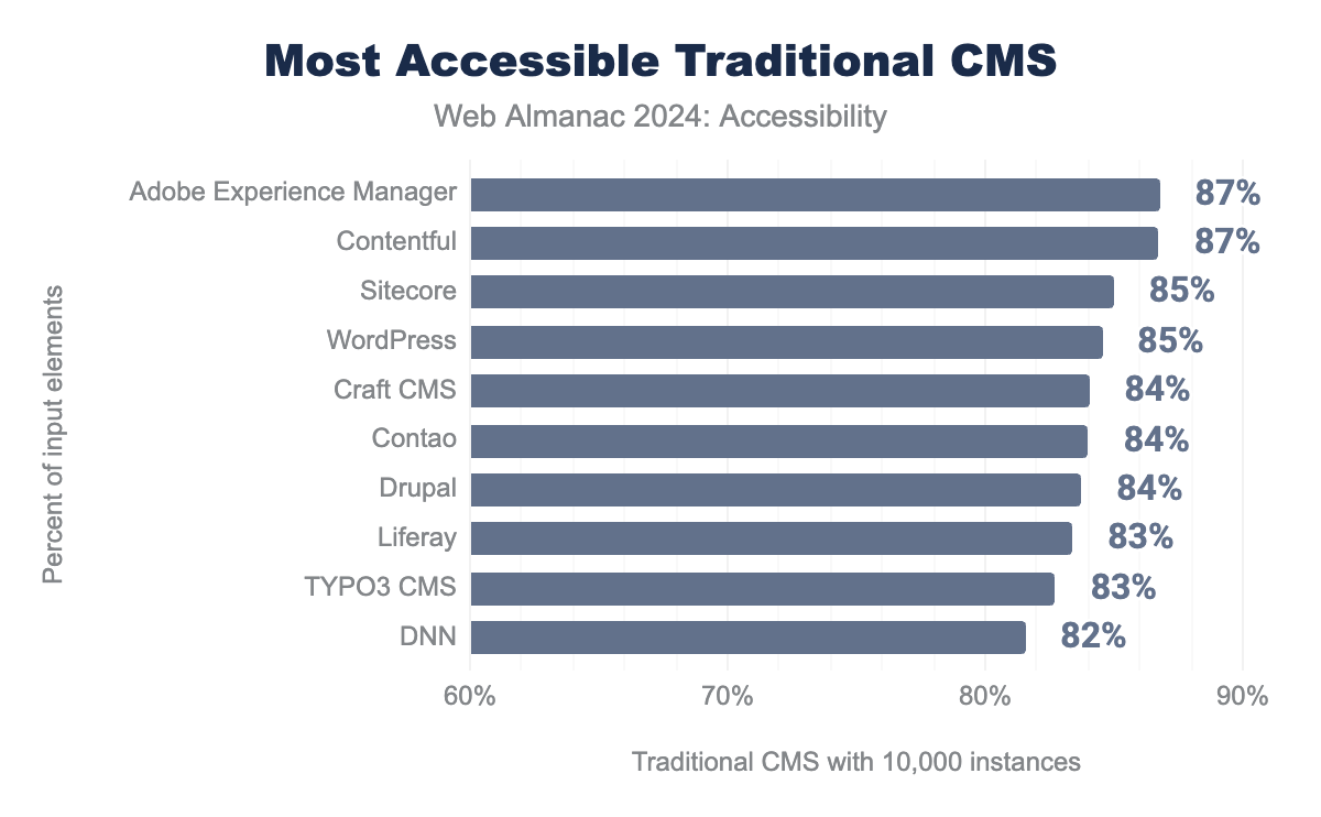
When most folks think about CMS, they think about the ones that you can download and install yourself. This is predominantly made up of open source tools, but not exclusively. Adobe Experience Manager (AEM), Contentful and Sitecore were the most accessible three in this list of top 10. A possible explanation for this is that closed-source software like AEM is more likely to be used by larger corporations, which have more resources to address accessibility issues. Additionally, open-source software gives website owners a lot of freedom, which in some cases can lead to worse accessibility.
Looking at audits of these Traditional CMS, the top four Lighthouse issues have a great deal of consistency. Color contrast, link name, heading order and alt text are regular problems across these CMS, those issues are mainly related to the user since a CMS can not be responsible for the chosen colors or the naming of the links.
| Traditional CMS | Most popular | 2nd most | 3rd most | 4th most |
|---|---|---|---|---|
| Adobe Experience Manager | color-contrast |
link-name |
heading-order |
label-content-name-mismatch |
| Contentful | color-contrast |
link-name |
heading-order |
image-alt |
| Sitecore | color-contrast |
link-name |
heading-order |
image-alt |
| WordPress | color-contrast |
link-name |
heading-order |
target-size |
| Craft CMS | color-contrast |
link-name |
heading-order |
image-alt |
The different CMS do have a lot of commonalities in the top errors that they have. They mostly have to do with content issues, which is something that ATAG 2.0 was written to support. It is hoped that the best practices of ATAG will be brought into WCAG 3.0. This scan is only for publicly available websites, so authoring interfaces are not evaluated. It is worth noting that authors have disabilities, and authors should be able to expect an accessible interface. Authors also need support in creating accessible content. To help facilitate greater focus on authoring tools, the W3C produced a ATAG Report Tool.
There are many tools which can be used to help authors evaluate the accessibility of a page. Institutions that control the browser configurations of their staff, could choose to simply install the open source Accessibility Insights browser plugin for all of their browsers. This would make errors much more visible to administrators. For many of the CMS above though, the best solution might be to install a tool like Sa11y or Editoria11y which is geared to help authors. From Joomla version 4.1 onwards Sa11y is included by default, so all authors benefit.
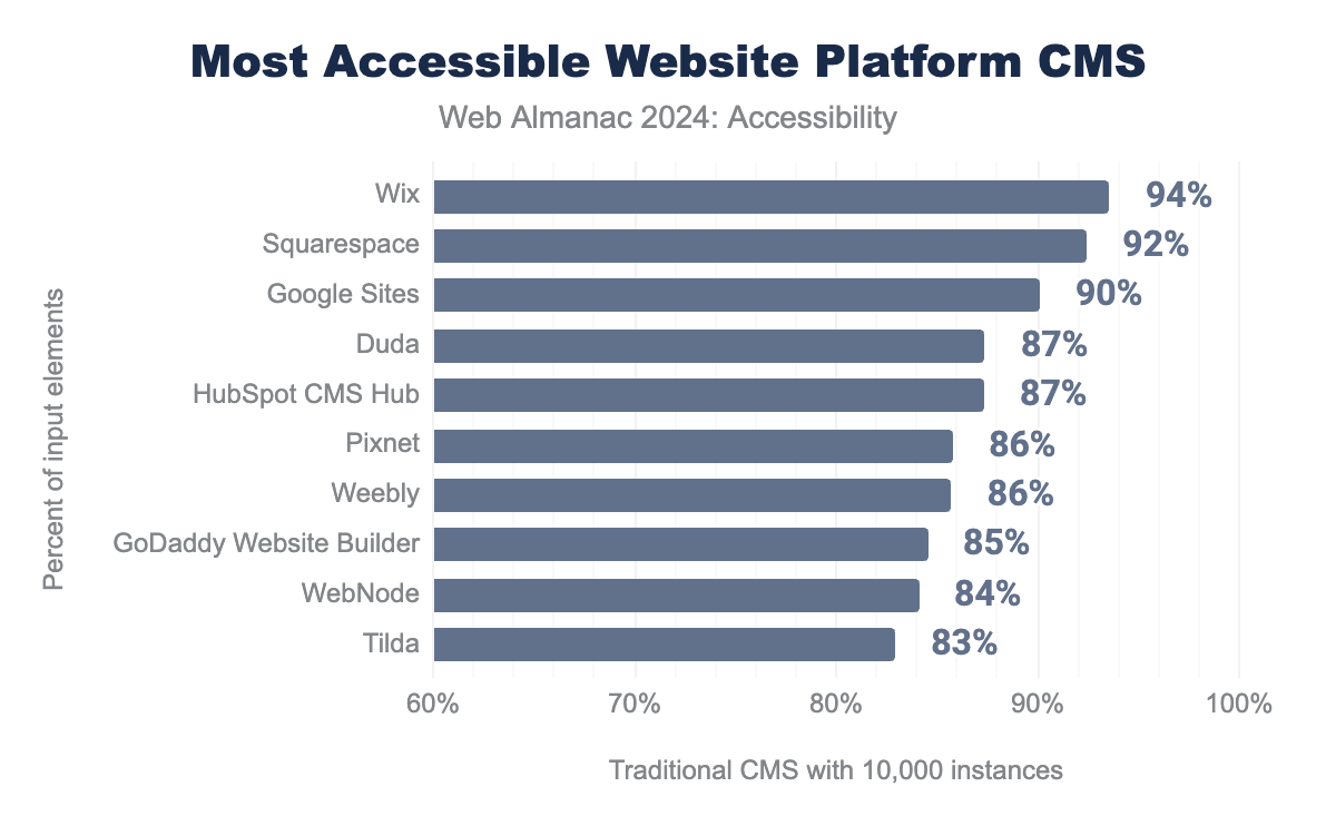
Website platforms in general performed better than the Traditional CMS with Wix, Squarespace and Google Sites being significantly better.
Looking at audits of these CMS Platforms, the top four Lighthouse issues have less consistency in the frewquency of issues but still have lots of similarities. Alternative text, link name, heading order and color contrast are all still issues, but just with different rates of occurrence.
| Platform CMS | Most popular | 2nd most | 3rd most | 4th most |
|---|---|---|---|---|
| Wix | heading-order |
link-name |
button-name |
color-contrast |
| Google Sites | image-alt |
link-name |
aria-allowed-attr |
heading-order |
| Duda | link-name |
color-contrast |
image-alt |
heading-order |
| HubSpot CMS | color-contrast |
heading-order |
link-name |
target-size |
| Pixnet | heading-order |
link-name |
color-contrast |
frame-title |
Different CMS platforms have varying strengths and weaknesses. For example, it’s clear that ARIA components must have accessible names, yet 36% of websites built with GoDaddy Website Builder fail this test, while the median failure rate for all CMS platforms with more than 100,000 occurrences in our dataset is just 1%. GoDaddy is also an outlier in the area of dialog names, with 14% of tests failing compared to a mean failure rate of 1.3%.
On the positive side, Duda stands out for button names, where only 3% of its websites fail the test, compared to a median of 13%. Even more impressive is Wix only 20% of Wix websites fail the Lighthouse test for color contrast, while the median failure rate among the most-used CMS platforms is 70%. Similarly, Wix performs exceptionally well regarding alternative text for images, with only 1% failing, compared to a median of 34%.
The differences show that it is possible for CMS to make an impact on accessibility even when the author needs to take the last step to make content accessible.
JavaScript Frontend Frameworks
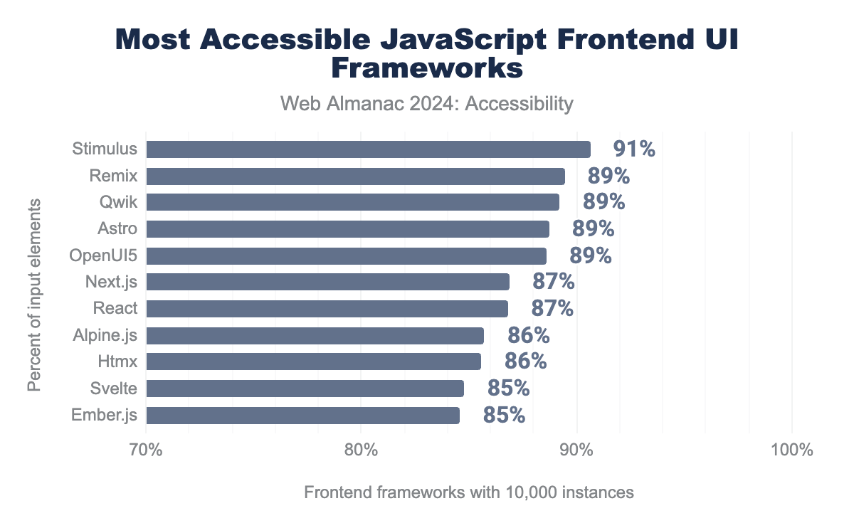
WebAim Million also looks at the impact of JavaScript frameworks and libraries. Again it is possible to see patterns in the data based on the libraries used. We have worked with the definitions from the State of JavaScript 2023.
Stimulus, Remix and Qwik are several percent more accessible on average than React, Svelte or Ember.js.
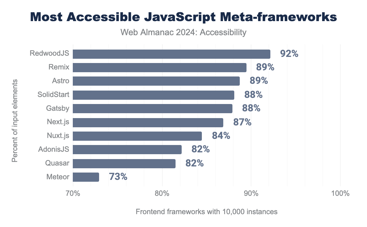
RedwoodJS is clearly the most accessible, followed by Remix and Astro.
Conclusion
Our analysis indicates that there hasn’t been a significant change in web accessibility. While there have been some improvements, many straightforward issues remain unresolved. Improving color contrast and use of image alt attributes could have a substantial impact if addressed. CMS systems and JavaScript frameworks have a huge responsibility and examples prove that they can have real positive impact on accessibility.
We often observe that features intended to enhance accessibility can sometimes create a false sense of improvement, while actually degrading the user experience. Many of these accessibility problems could be avoided if designers and developers integrated accessibility considerations from the start rather than treating them as an afterthought. Organizations must prioritize accessibility training, operations, and budgets to enable the development of more accessible user experiences. Some governments have demonstrated how effective that approach is.
The web community must understand that a website only offers an excellent customer experience when it accommodates everyone. In 2024 we should not be discriminating against people based on the device, browser or assistive technology used. We have focused on key metrics that are straightforward to address and are hoping to see more improvements in 2025.
